CASE STUDY — 03
The PIM Shell & Design Library
Where design decisions meet the framework.
- Role
- Design systems lead (UX)
- Duration
- —
- Constituencies
- Frontend engineering · Plug-ins / Capital Tools / Minor Materials / TEO teams
- Stack
- Angular Material/CDK · Sass @use/@forward · CSS custom properties
Summary
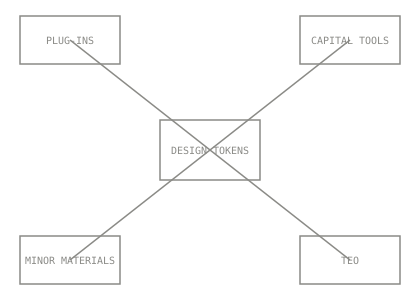
Context. Because Plug-ins succeeded, AT&T funded a rebuild of its sibling inventory applications — Capital Tools, Minor Materials, and a new order-management app (TEO) — as a single Procurement and Inventory Management platform, sharing one visual language and one set of components across four independently-built Angular applications tied together by a micro-frontend shell.
Problem. A shared design system only works if the tokens and patterns actually survive contact with the underlying framework. Angular Material renders its own internal styling and injects DOM outside the application root, which meant design decisions could quietly get overridden or become impossible to target with ordinary CSS — a governance problem, not just a styling one.
Contribution. I built and maintained the design-token architecture the platform runs on, debugged real Angular Material/CDK styling issues directly in the codebase alongside frontend engineers, and became fluent enough in the actual implementation — local environment, dependency management, Sass architecture — to be a genuine second set of eyes on frontend quality, not just a design handoff.
Impact. A token system and Material integration layer other applications in the platform can build on, several concrete implementation bugs found and fixed at the CSS/framework boundary rather than shipped, and a working relationship with the frontend team built on real technical fluency rather than a Figma-to-code handoff.
The problem: one visual language, four separate codebases
PIM's success created a new architectural problem. The platform was expanding from a single application into four — Plug-ins, Capital Tools, Minor Materials, and TEO — each independently deployable, tied together by a lead developer's Angular "shell" or micro-frontend wrapper that lets users move between them based on permissions.
The technical approach under discussion used iframes to isolate each sub-application. That's a defensible engineering trade-off — codebase independence, deployment decoupling, security sandboxing — but it comes with real UX cost if nobody owns the shared visual layer deliberately: cross-origin session-state issues, styling drift between applications over time, broken tab order and accessibility across iframe boundaries, and inconsistent theming unless there's a genuinely shared source of truth for design decisions.
I flagged this early and pushed for the practical mitigation: extracting the common UI patterns already built for Plug-ins into something closer to a shared design-token and component foundation, rather than letting each new sub-application reinvent its own version of "the AT&T inventory look."
FIG_01 — token architecture
Design tokens that actually survive Angular Material
The harder, more interesting problem was making PIM's own design decisions durable inside Angular Material — a third-party component framework with its own theming system, its own generated class names, and its own DOM behavior.
What I found: Angular Material renders many of its interactive components — dropdowns, autocomplete panels, dialogs — into a global overlay container (.cdk-overlay-container) that sits outside the application's own root element. Ordinary component-scoped CSS can't reliably reach into that container, and styling it globally risks regressions everywhere else in the app. That single architectural fact explained why apparently small UI fixes ("just move this dropdown 4px") could turn into disproportionately difficult debugging sessions.
.pim-app {
  --mdc-outlined-text-field-outline-color: var(--hairline);
  --mdc-filled-text-field-focus-active-indicator-color:
    var(--color-accent);
  --mat-select-panel-background-color: var(--color-surface);
}component tree — tokens scoped here
What I did about it:
- Audited the Material implementation to understand the distinction between Angular Material's own tokens, the underlying MDC (
--mdc-*) tokens beneath them, and PIM's own design tokens — and worked out where each layer should own a decision. - Established a centralized integration layer (
mat-theme.scss) so Material customization lives in one place, mapped explicitly onto PIM's existing token values, instead of scattering Material overrides across dozens of component files. - Debugged a real production issue in the Location/ALC autocomplete component, where the expected style class wasn't reaching the rendered overlay — tracing it through
panelClass,MatAutocompleteTrigger, and the generated overlay DOM until we found where the intended styling was actually landing (and where it wasn't). - Traced a genuinely strange bug where closing a Material dialog left a stray global
font-size: 16pxrule applied to every element on the page — working through CDK's focus-trap and focus-restoration behavior with the frontend team until the actual cause (rather than a CSS patch over the symptom) was identified.
None of this is "I learned Angular Material syntax." It's closer to: I worked at the boundary between the design system and a framework that didn't naturally cooperate with it, and found where the framework's own architecture made simple design decisions harder to implement than they should have been — which is exactly the kind of problem that either gets fixed properly once, or gets patched badly forever.
The token architecture itself
PIM's design tokens are implemented as native CSS custom properties — --color-primary, --font-size-body, and so on — scoped under a .pim-app class rather than the document root, specifically so PIM-owned design decisions stay identifiable and separable from the much larger set of framework and package-level CSS variables that show up in browser DevTools on an enterprise Angular application. That's a small decision with a real payoff: when something looks wrong, you can actually find out whether it's a PIM decision or a framework default.
Over the life of the project the token set grew from a single flat file into a modular structure — colors, typography, spacing, and component-specific tokens — with the underlying Sass architecture migrated from the deprecated @import system to @use/@forward. Because the tokens themselves are CSS custom properties rather than Sass variables, that migration didn't force every consumer of the design system to start namespacing every token reference — existing code kept working.
The spacing scale that came out of this work is a good example of the kind of decision that looks small in isolation and compounds across a four-application platform: once it exists, nobody has to decide spacing values on a screen-by-screen basis again.
The spacing scale itself, rendered to relative height — 4 / 8 / 12 / 16 / 24 / 40px, expressed as rem-based tokens.
Responsive components, not responsive pages
Rather than defining PIM's components around fixed device breakpoints, the direction I pushed toward was container-query thinking: a component's responsive behavior should be driven by the space it actually has available, not by an assumption about what device it's rendering on. That matters specifically because PIM's components get reused across different shells and contexts as the platform grows — a component that only knows how to respond to "mobile" or "desktop" breaks the moment it's dropped into a narrower panel inside the shell app.
One concrete example this surfaced: a Safari-specific mobile bug where modal action buttons could be obscured by the browser's dynamic chrome.
.modal-actions {
  padding-bottom: 16px;
  height: 100vh;
}.modal-actions {
padding-bottom: calc(
var(--space-4) + env(safe-area-inset-bottom)
);
height: 100dvh;
}Small CSS detail, but it's directly tied to whether a user can actually complete the task they opened the modal for — which is the standard I try to hold implementation details to.
Becoming fluent enough to actually help
Being useful at this level required getting genuinely comfortable inside the codebase, not just reviewing screenshots of it. Over the course of the Angular 16 → 19 migration, I had to:
- Get PIM running locally against AT&T's internal JFrog Artifactory npm registry (not the public registry), including diagnosing expired authentication tokens.
- Work through real dependency conflicts introduced by the framework upgrade — mismatched peer dependencies between Angular ESLint tooling and the CLI version, Angular CDK 19 against experimental Material packages, and the practical reality that "the app is Angular 19" and "every dependency in the app is aligned to Angular 19" are two different problems.
- Understand why the legacy "Rapid" UI library — a source of a lot of the visual inconsistency PIM had accumulated — was being retired, and treat that retirement as a design opportunity to replace one-off styling with the semantic markup and token-driven patterns described above, rather than just a dependency cleanup the frontend team handled alone.
The npm troubleshooting itself isn't the point. The point is what it bought: a clear enough understanding of the actual implementation environment that I could tell the difference between a design decision, a framework limitation, and a fixable bug — and argue for the right fix instead of the easiest one.
Outcome, honestly stated
- A design-token architecture (
.pim-app-scoped CSS custom properties, modular by category, native rather than Sass-variable-based) that Capital Tools, Minor Materials, and TEO can build from rather than starting their own from scratch. - A working
mat-theme.scssintegration layer that gives the team one place to reconcile PIM's design decisions with Angular Material's own theming system. - Multiple concrete implementation bugs (the autocomplete overlay class issue, the dialog focus-trap font-size regression, the Safari modal safe-area problem) found and resolved at the design/frontend boundary — the kind of issue that's easy to miss if design and frontend stay in separate lanes.
- A working relationship with the frontend team built on genuine technical fluency — I'm the person they bring UI implementation questions to, not just the person they hand a Figma file to.